Empowering people to make the most of their energy
Empowering people to make the most of their energy
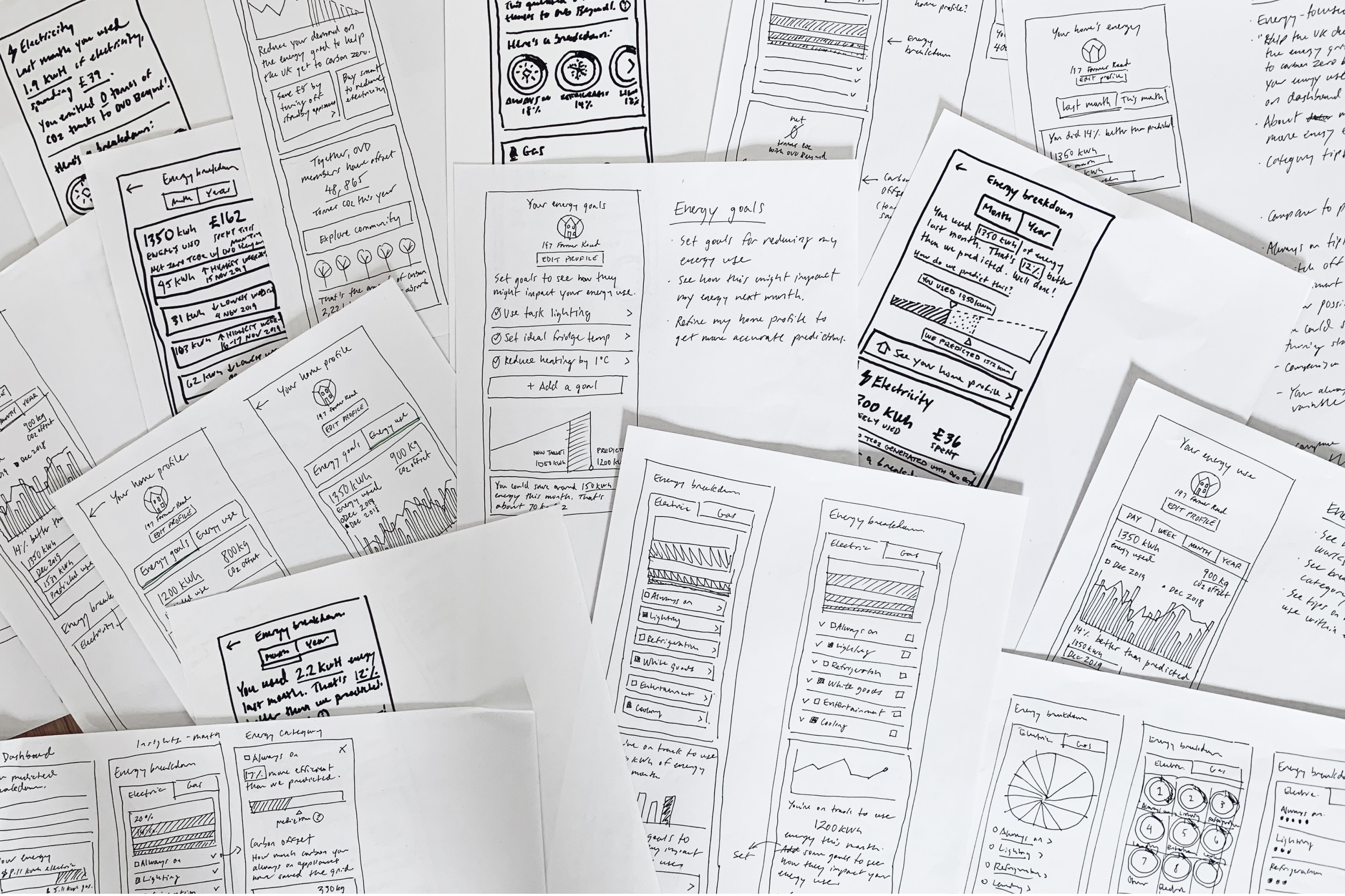
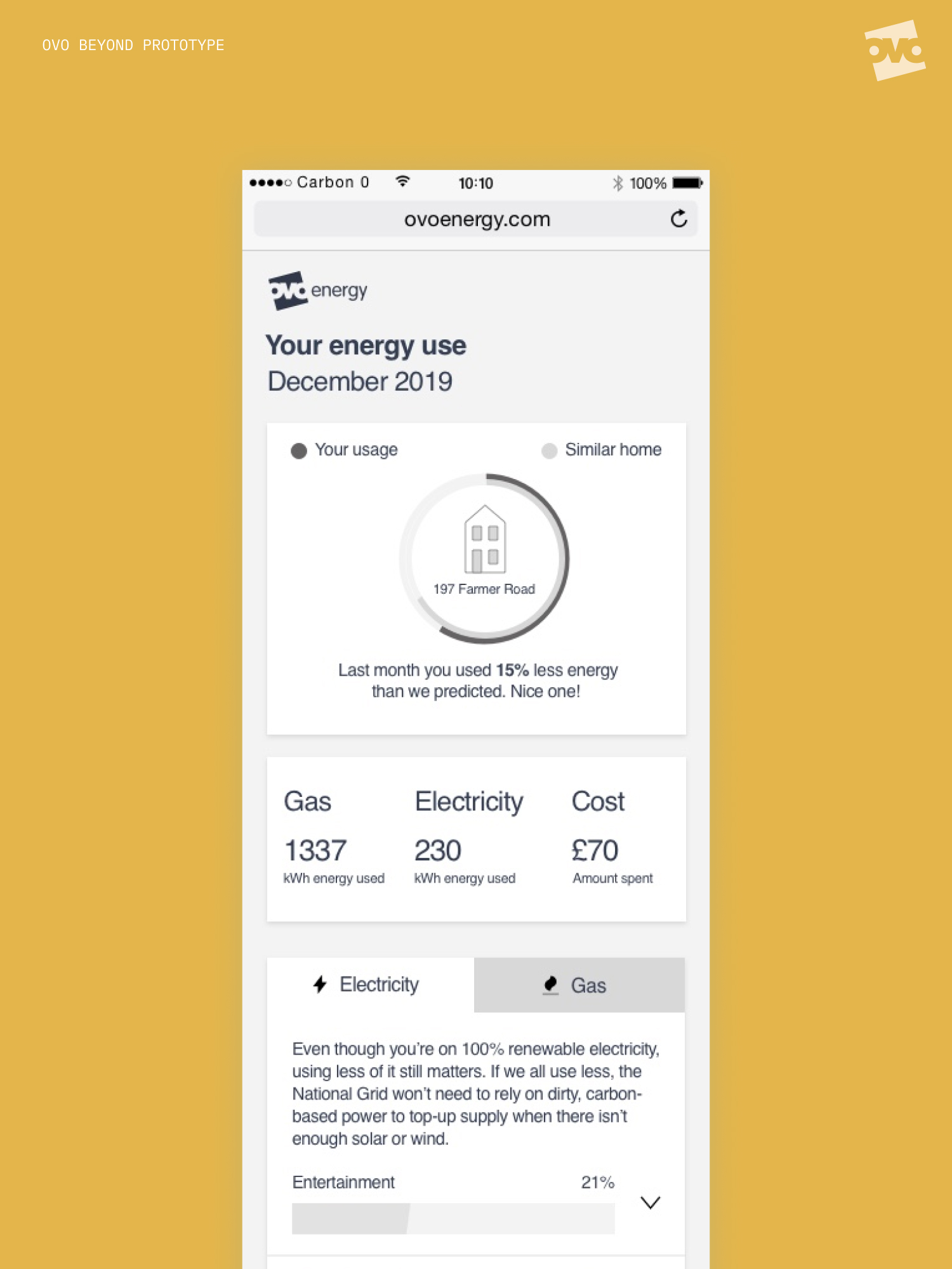
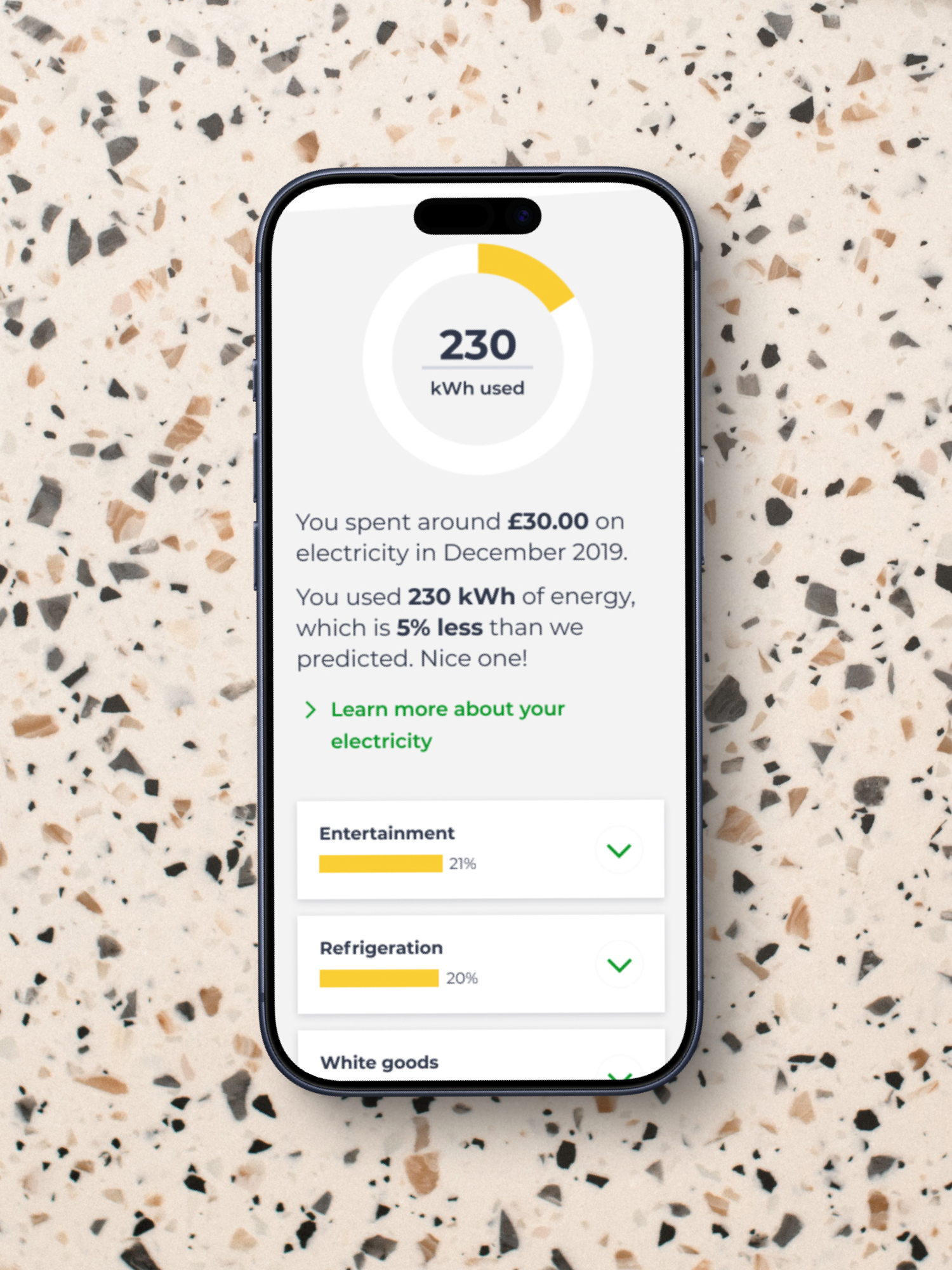
Home energy contributes over a quarter of all UK household emissions, but isn’t widely understood by the average consumer. OVO was keen to help people make sense of their home’s energy and improve its efficiency as part of their OVO Beyond zero carbon initiative.
I worked with a team of data scientists, researchers and a junior UX designer to quickly prototype, validate and build an energy insights experience using a make-test-iterate approach. This resulted in Energy Spotlights, a tool that offers users an overview of their monthly energy consumption and insight into the most energy intensive areas of their home, along with actions to help them curb their usage and save money.
Unlocking a new platform for millions of customers
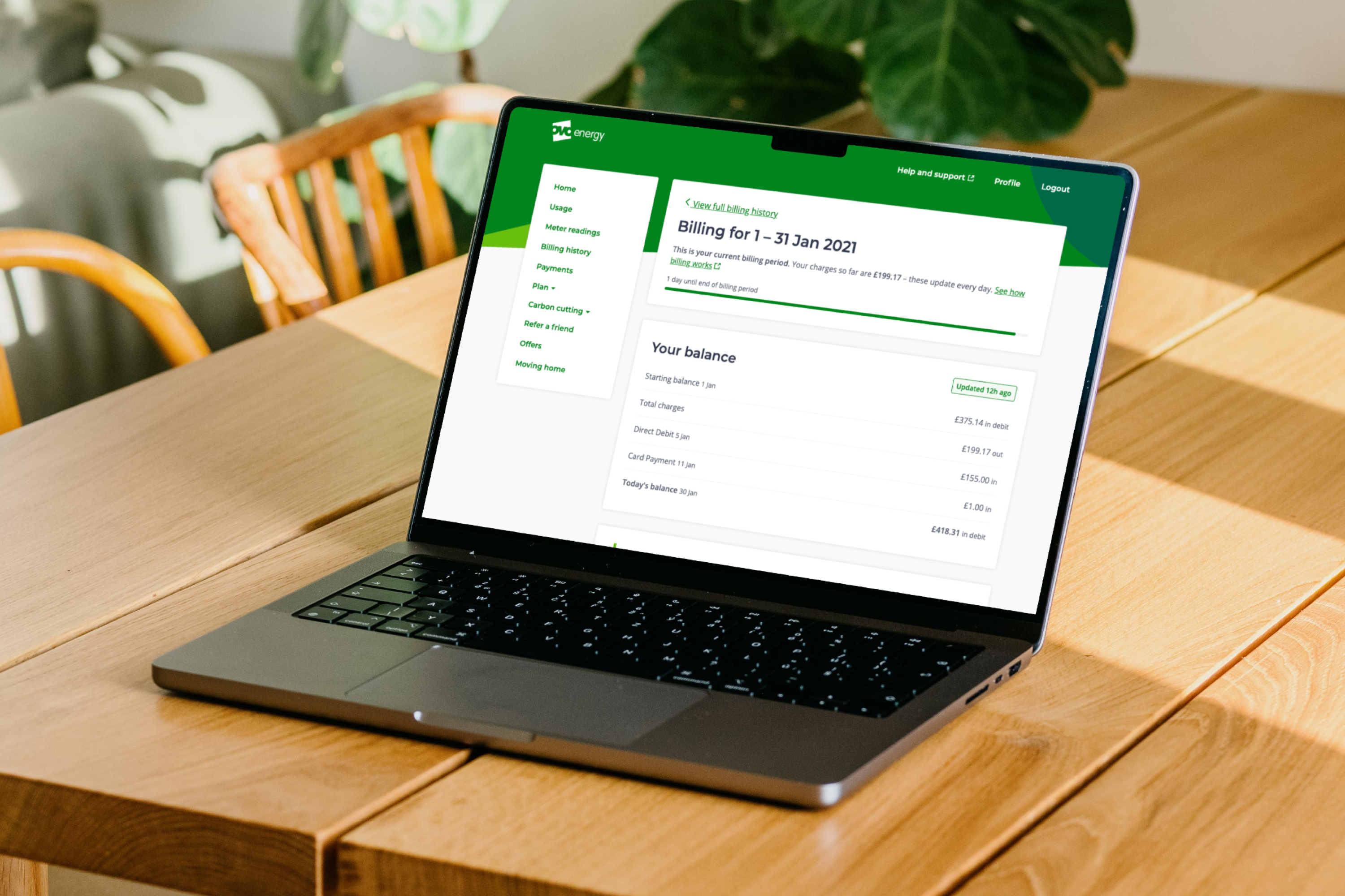
Along with the work on zero carbon, OVO was in the process of building a new customer portal, Orion. Migrating millions of energy customers away from the existing third-party platform onto Orion was one of their key business objectives for 2020, but migration couldn’t begin because the new user experience wasn’t good enough. Orion lacked basic functionality, had usability issues and couldn’t yet support OVO’s subsidiary brands.
My team performed a complete audit of both platforms: feature gap analysis, customer feedback synthesis, user data review and conversations with every product team across OVO to understand their roadmaps. We identified core UX improvements, built a design system called Nebula with accessibility as a primary consideration and white-labelled the platform to enable migration of OVO Group’s subsidiary brands. SSE alone had a fundamentally different information architecture, which was more interconnected and deeper than Orion’s. Getting them onto the same platform meant understanding the service gaps and creating a core experience flexible enough to accommodate both.
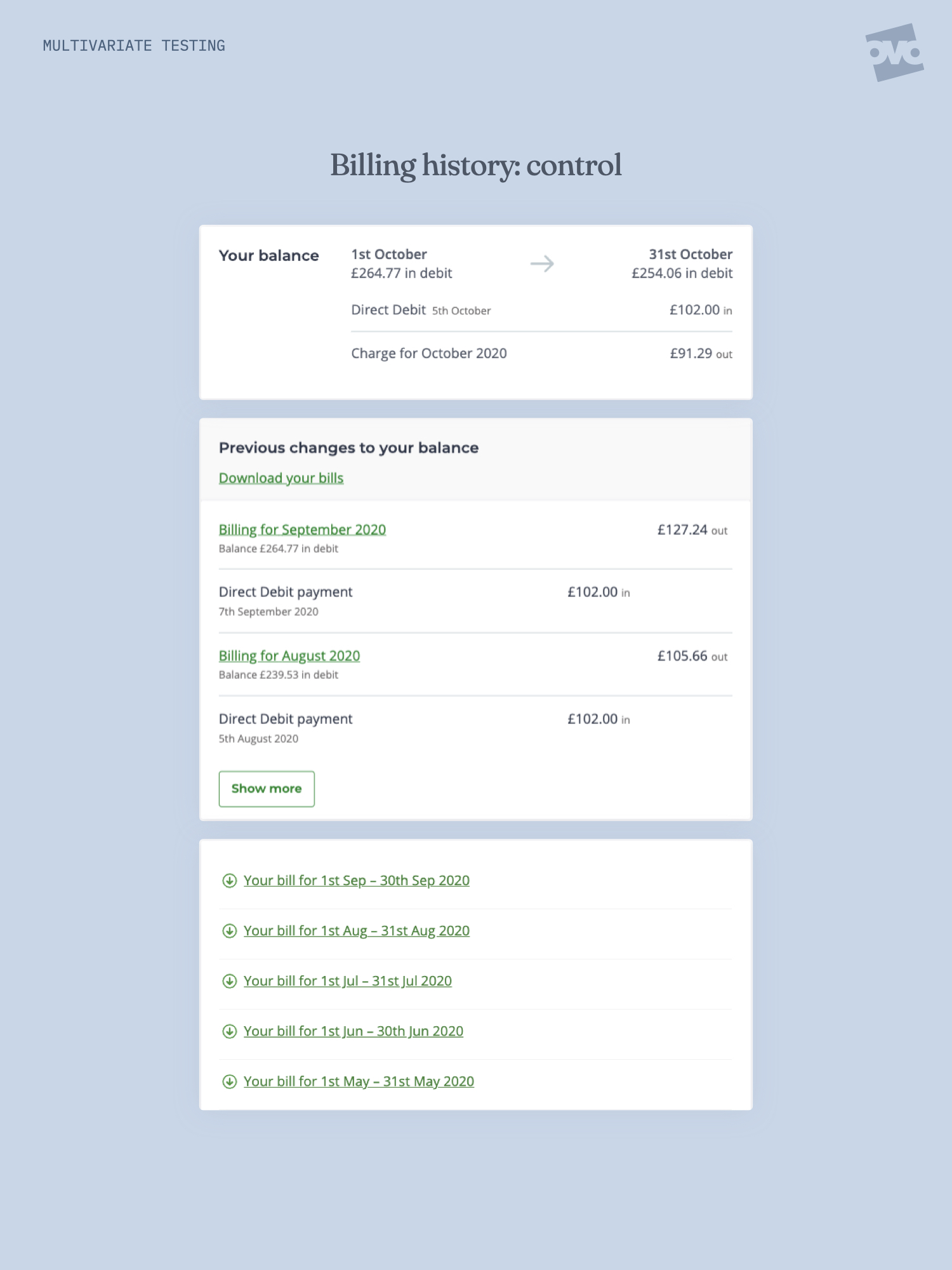
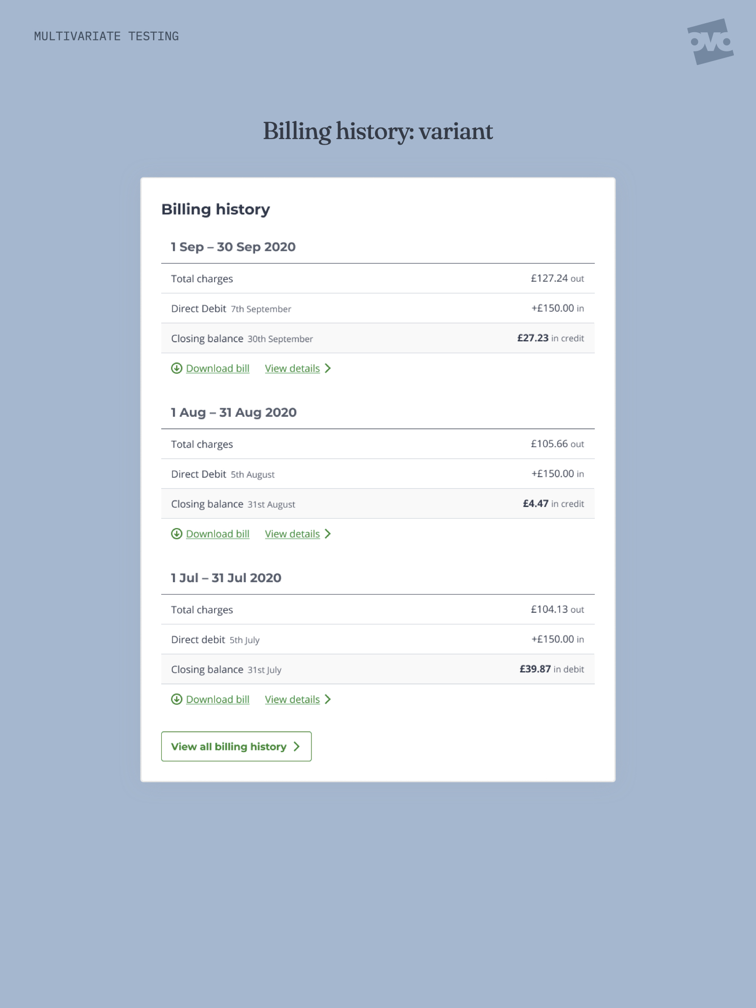
Improving customer satisfaction using multivariate testing
Orion’s billing experience posed a bigger problem: it had a customer satisfaction score below 4, which meant additional customers couldn’t be migrated until it improved. User feedback pointed to a theme we hadn’t expected, which was that customers didn’t understand the information they were looking at — they related to billing in terms of monthly cycles, but the existing interface scattered that information across multiple modules.
I led a one-week sprint to design and test an improved billing experience. We quickly built a prototype to test against the existing design, with decisive results: participants consistently failed basic tasks in the existing experience, often believing they’d completed steps when they hadn’t. Every task in the redesigned prototype was completed successfully. The redesign was built and rolled out immediately. The resulting boost in customer satisfaction meant migration could resume, with Orion becoming the default experience for 100% of OVO customers.